


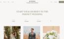
قالب گردشگری و توریستی
دمو قالب سازنده : joomlabamboo سازگار با : جوملا 3 نسخه : 1.0.5
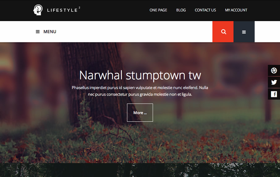
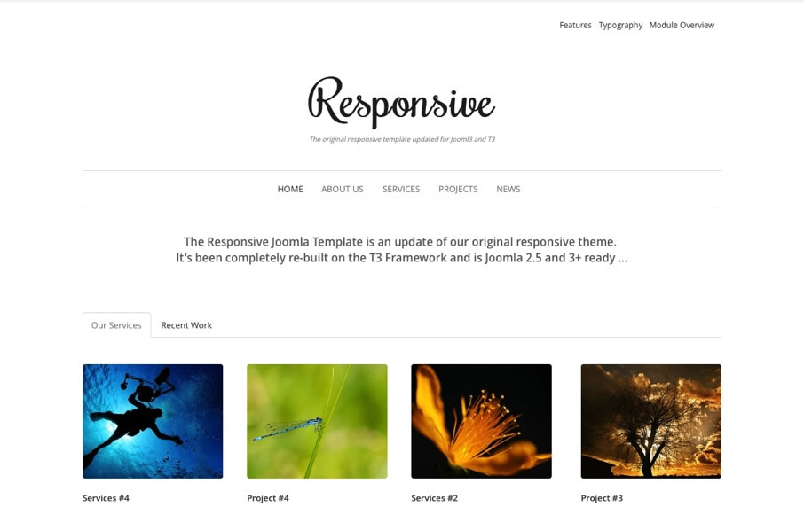
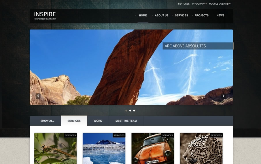
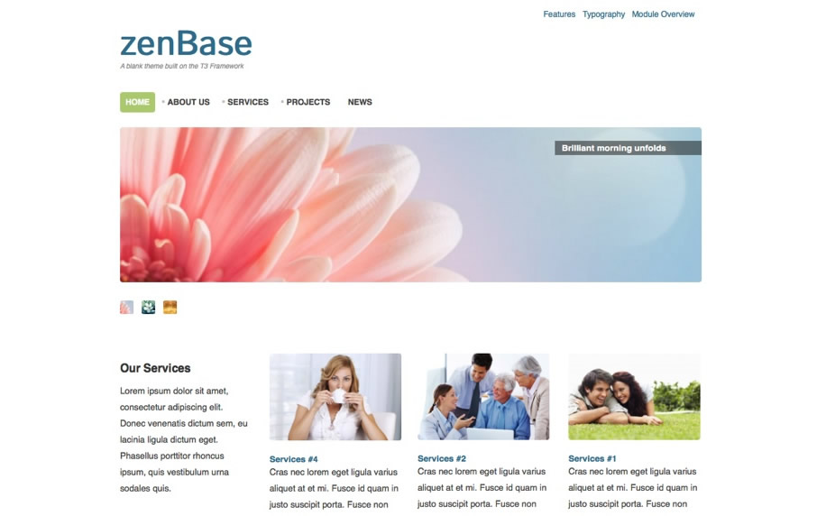
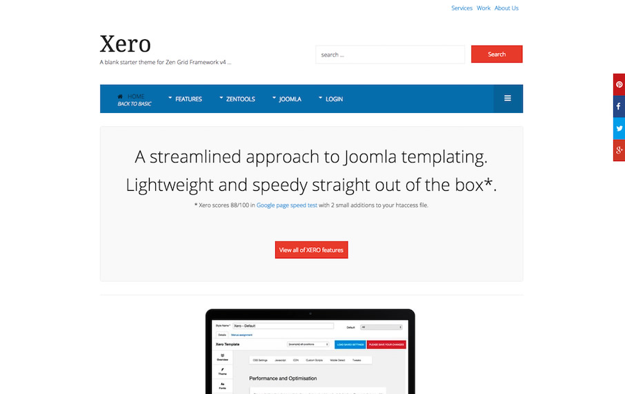
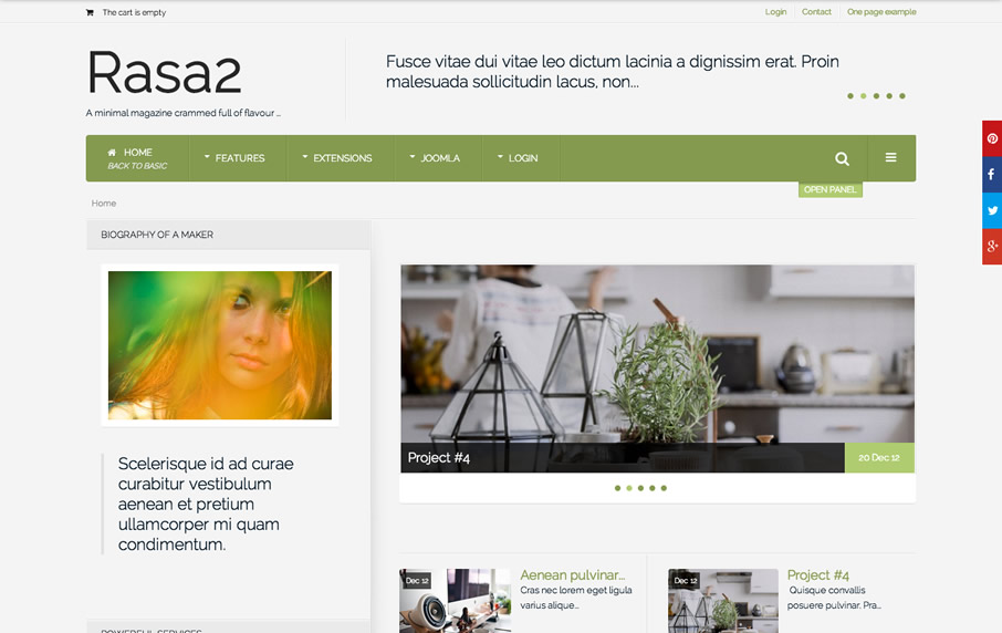
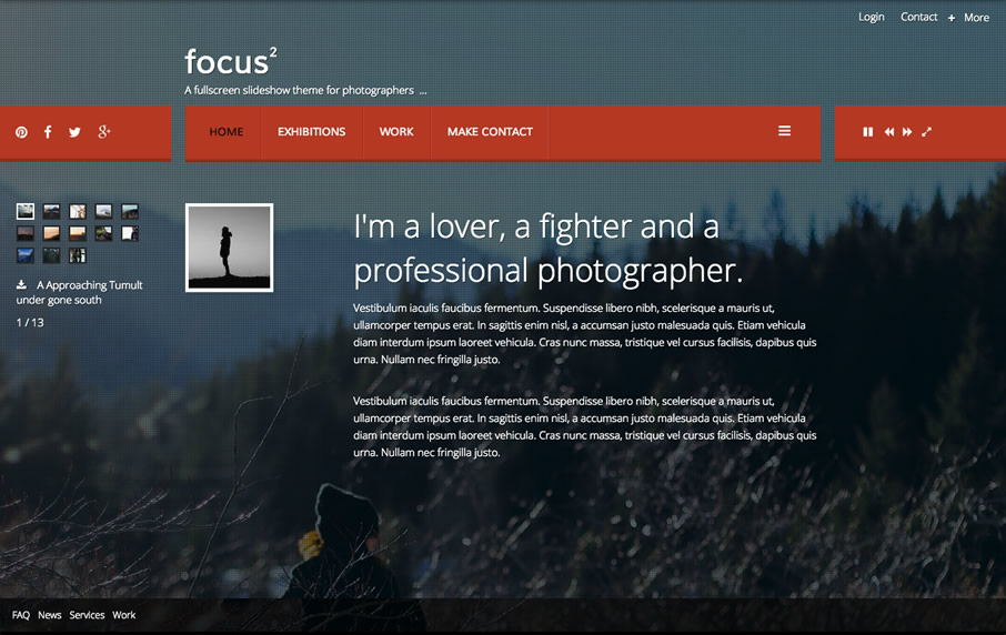
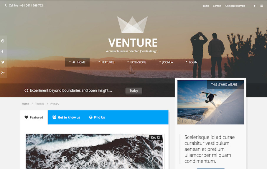
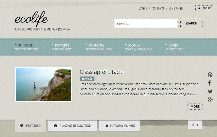
قالب JB Lifestyle2 محصولی از شرکت joomlabamboo ساخته شده با فریم ورک T3 می باشد . یک قالب جوملایی عالی ریسپانسیو چند منظوره می باشد . از ویژگی های مهم قالب JB Lifestyle2 می توان به استفاده از ماژول نقشه ی JBMaps2 , افزونه ی ممتاز و منعطف Zentools2 , عملکرد و سرعت بالا , پنل مخفی برای نمایش ماژول هایی مانند ورود کاربران, منوی آکاردئون برای تبدیل هر منوی عمودی جوملا به منوی آکاردئون یا پنل,سازگار با Bootstrap2 و Bootstrap3 , پشتیبانی از فونت های گوناگون , منوی کشویی با 3 نوع افکت متحرک و شمارنده JB Countdown و ریسپانسیو بودن اشاره کرد . هم اکنون می توانید این قالب جوملایی ارزشمند را از گلچین آنلاین دانلود کنید.
 153.81 MB
 برای دانلود این محصول شما نیاز به خرید اشتراک دارید اگر عضو هستید با حساب کاربری خود وارد شوید.
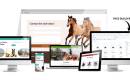
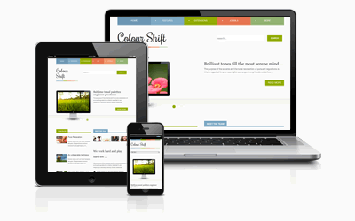
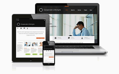
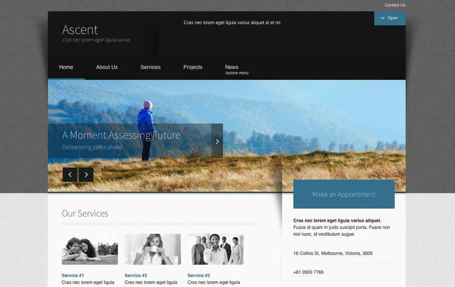
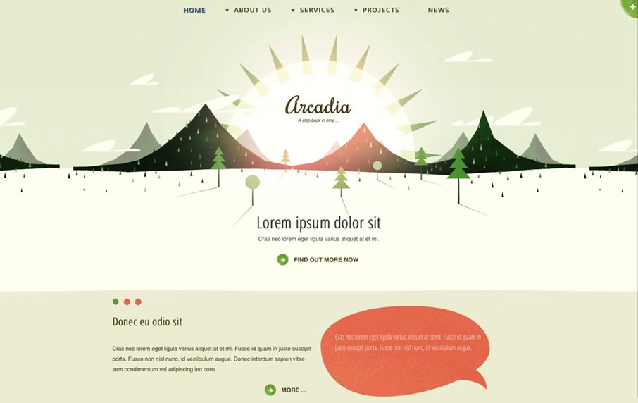
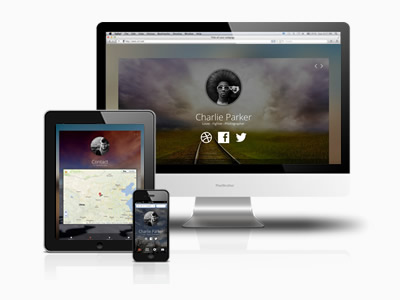
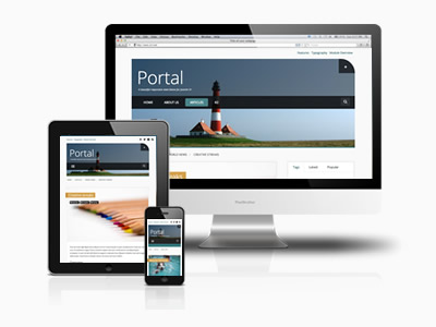
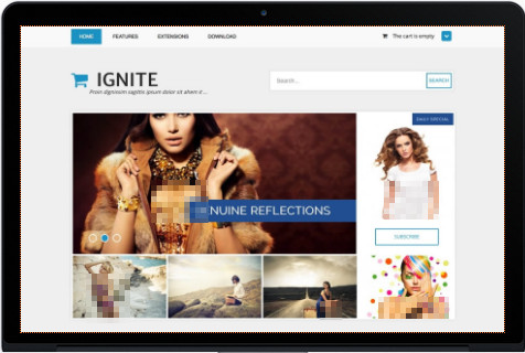
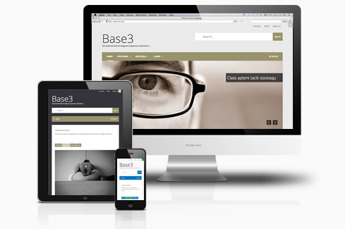
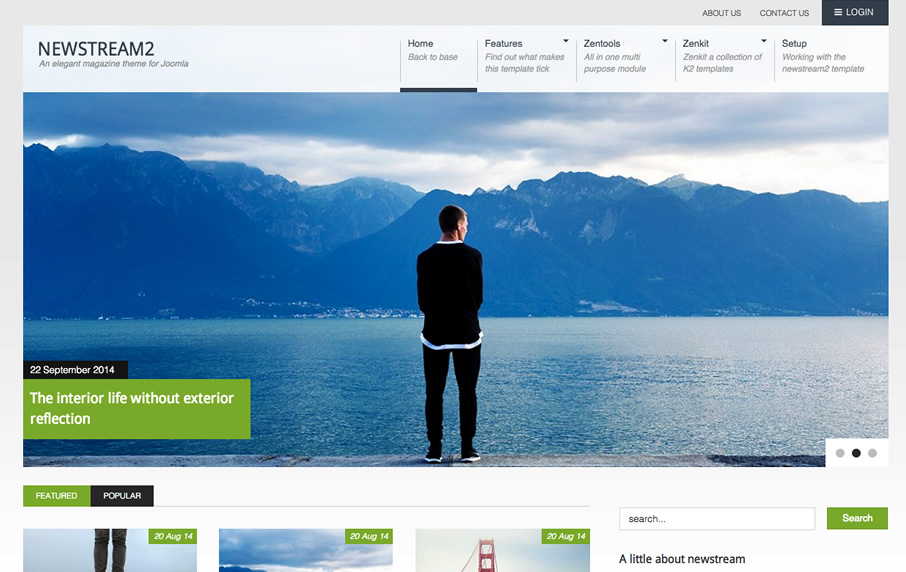
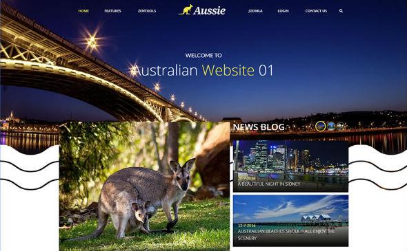
More than just a way of life, Lifestyle2 is designed to be a super flexible full width responsive template for any Joomla site. Built on Bootstrap 3 and T3 it's the ideal partner for your next Joomla venture.
FLEXIBLE, FULLWIDTH, RESPONSIVE ...
Lifestyle2 is a 2014 update for one of our more popular responsive Joomla templates - Lifestyle. Lifestyle2 features a number of design and functionality improvements including a leaner flatter design, full bootstrap and T3 support which means you get the added bonus of almost universal Joomla extension support plus a powerful framework with modern responsive features built into the template.
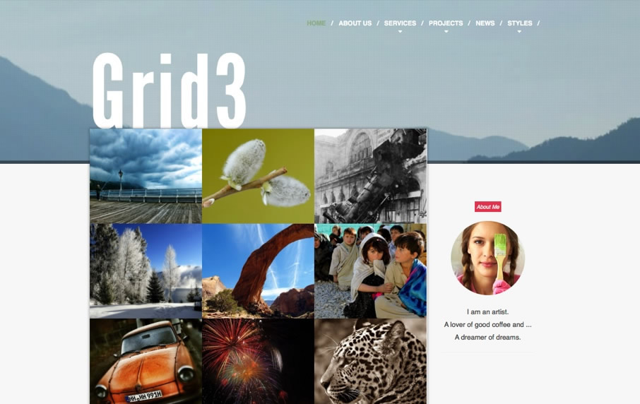
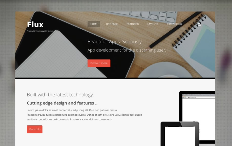
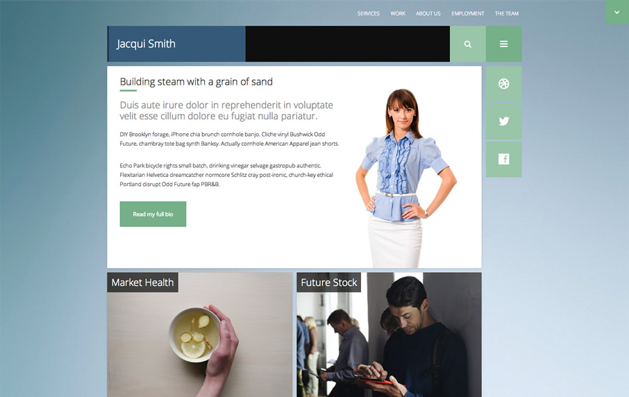
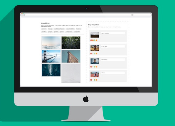
Get animated with Zentools
The Lifestyle2 demo features the latest version of our Zentools module now has the ability to smoothly slide and fade your images, title text and more in when the content appears in the content.
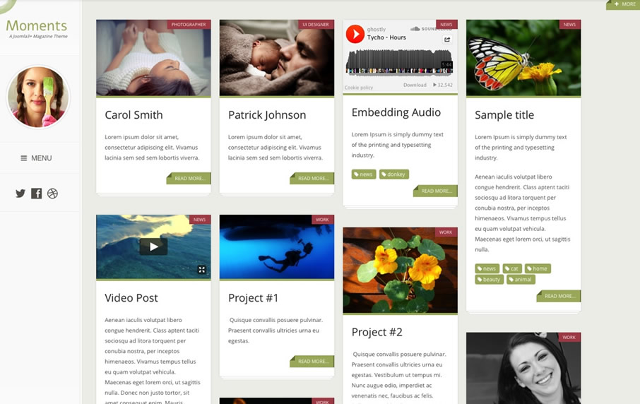
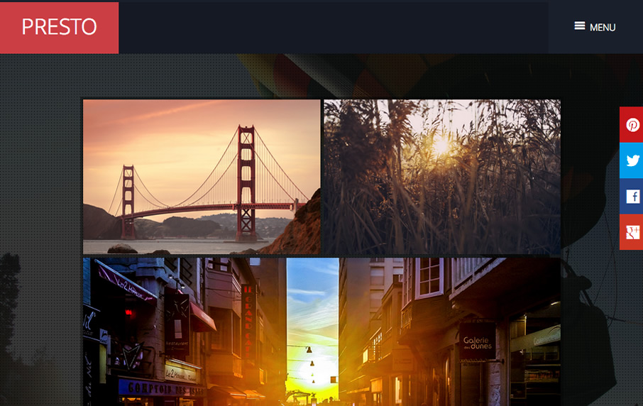
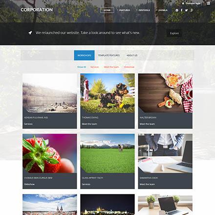
A new stacked layout for Zentools
Zentools has also been updated to feature a new layout called stacked. Stacked balances full width fixed background images beneath your content items in order to create a faux parallax effect.
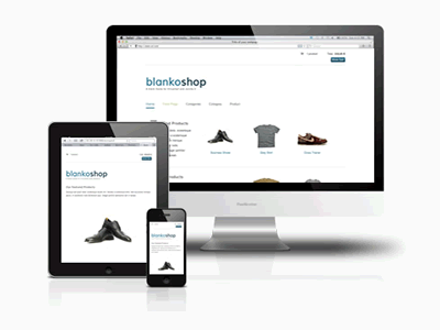
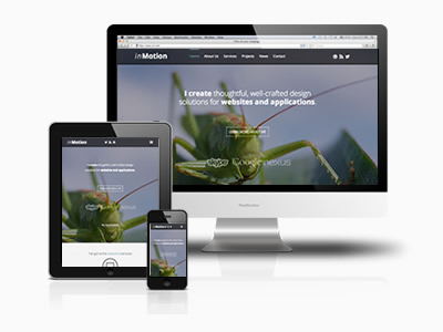
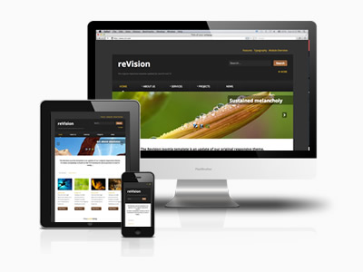
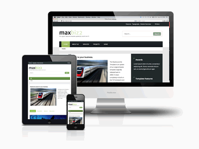
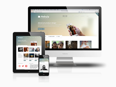
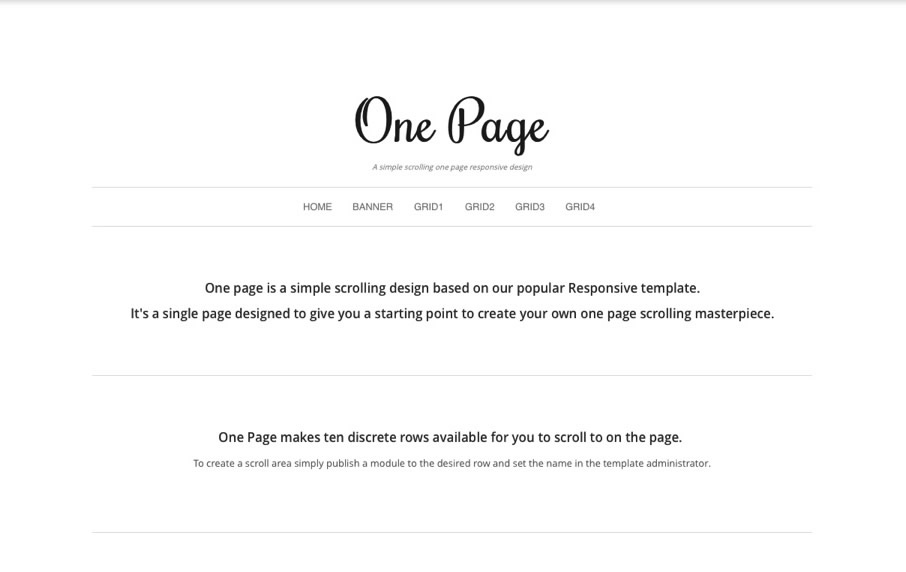
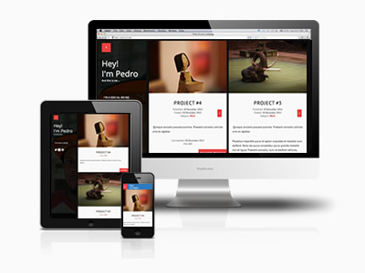
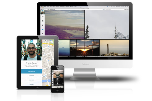
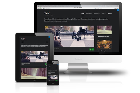
Responsive template design
The Lifestyle2 features an intelligent responsive design that changes it's display
depending on the size of the screen your visitor is viewing your site with. This means that you only need a single design
to work on the multitude of tablets, phones, laptops and desktop screens that your visitor may be viewing your site with.


